The brief for this assignment was to design a new label for either a wine bottle or a vodka spirit bottle. I chose to do the vodka label and to create a new name and label for this brief instead of changing an exsiting one. I first researched the history of Vodka and then researched vodka bottles and labels which then inspired me in creating my own.
After reasearching the spirit drink "vodka" I discovered that two main countries for the birthpalce of the spirit vodka were Poland ans Russia. It was used as a simple drink that the people drank with there meals. The word Vodka was said to originate from the word Voda from Russia country which means water. It isn't sure which place the spirit orignated from but it is known to have been birth date around the begining of the twelfth century. The Vodka spirit wasn't always an alconolic drink; actually it was created for medical purposes and it wasnt till the middle of the fourteenth century that vodka was discovered to have intoxicated charteristics in it. In Russia it was believed that vodka had its own spirit and it would be used at religious events and anyone who did not drink would be called impious.
Vodka was known to have many different names some of which was wine, distilled wine, burning wine, burnt wine and bitter wine.
It wasnt't till 1930's when vodka was popular in the US. When the Smirnoff Company opened its buisness and they intriduced "gold vodka" which is vodka aged for ten years in oak casks before its sold. Vodka is one of the most popular drinks in the world and will continue to be for a long time.
Photos of different type of Vodka that I found inspiring:


What I liked about these vodka bottles and designs was that they were different and not the usual shape. I also liked the design used on the bottles, either frosty effect or curves on the bottles. I have done some sketches designs for my final bottle of Vodka.

Photos of Labels and typography:


Here is a selection of labels that I found interesting and helped me with my designs. Below I have posted some of many sketches of the font for the label that I thought would be most appropriate. I have also sketched some labels designs as well.

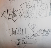

I chose to use the following type on my label as to me I thought was different and its the younger generation that drinks this spirit, so this slick style of writing would be appropriate for a new century. I was unsure at this stage which font to use but I had chosen the name of my brand, "Voda Vodka" the word "Voda" was the word the Russian use for the spirit at the early birthplace and to add both together it relates the old and new names together.
Below I decided to experiment with a design for a logo, as from vodka labels in this century, there was a logo. I experimented with the positioning of the letters and the two first letters of the name.

After some sketching of bottles and font, I had chosen the design for my bottle and the logo and label. The bottle design was designed to match the font type of the label and to make it different then the usual bottles of spirits. It has the usual long tall shape of a vodka bottles but at the top, ice cubes at the brim to make it more modern and appealing.
Below is a photo from my sketch book of the bottle, label and logo. There was also some experimenting on the positioning of the label and logo and colour, but this is the end design in sketch.


I designed packaging for the Voda Vodka spirit in which it can be sold separately and on special occasions. The design of the packaging is a cylinder tube, to correspond to the new style and the colours used were the same used for the bottle and label. I did sketches of other packaging before coming up with the final design.

Finally I also took the opportunity to experiment with the logo and name by displaying them on certain things, such as the Voda vodka delivery van, beer mats, posters, box’s of the vodka, glasses and billboards.


Final Vodka design created in photoshop


I have also created the packaging for the vodka label and beer mats advertising the spirit drink.


