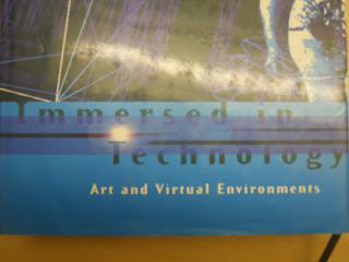
Our first assignemnt was to take a photo of typography that we thought was good and bad. The two images that I have choosen are below.
After some feed back i was abel to find more type for each.
Good Typography
I thought this was a good example of typography because there is a mixed use of size on the fonts and they can both be clearly seen against the background. The typography colours and image is sharp and clearly seen and of good size for the front cover of theis book. Bad Typography
I used this example of typography on a sainsburys bag as a example of bad typography because it is hard to see on the orange background.


No comments:
Post a Comment